Case Study - A crowded menu, made simple
A new public website for an on-demand homeschool chemistry and science course. The old site asked parents to choose from fifteen menu links before they knew where to start.
Visit ChemExplained- Client
- ChemExplained
- Year
- Service
- Website redesign
- Website
- Visit site
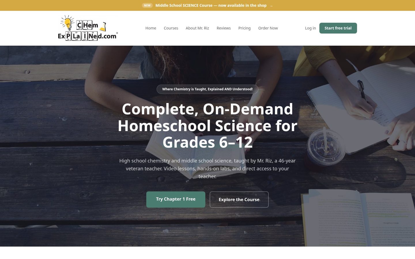
ChemExplained is a complete, on-demand homeschool science course for grades 6 to 12: high school chemistry and middle school science, taught by Mr. Riz, a chemistry teacher with 46 years in the classroom.
The client
Richard, ChemExplained’s owner, hired me to redesign its public website. Its customers are homeschooling parents choosing a science course for their children, often without a science background of their own.
The problem with the old site
The old public site put fifteen links in its main menu: Reviews, Testimonials, Learn More, Discounts, Labs, Calendars, FAQs, Free Trial, Why CE?, Privacy, Login, Shop, Checklist, About the Instructor and Other Subjects. A parent arriving for the first time had to work out where to begin, and the design had not kept up.

What I built
- A new public site on Laravel: the pages a parent reads before buying, rebuilt from scratch.
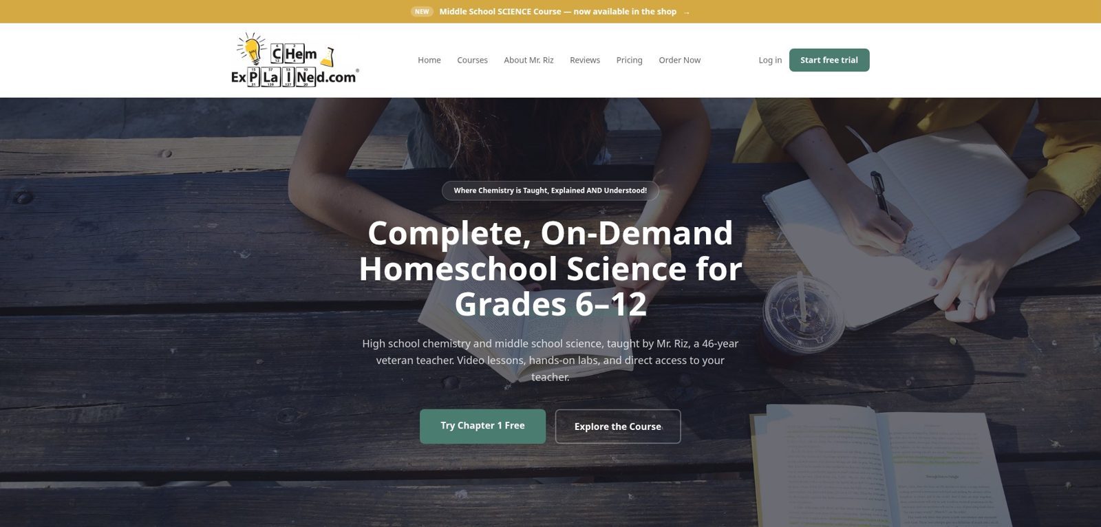
- Simpler navigation: six menu links (Home, Courses, About Mr. Riz, Reviews, Pricing, Order Now), a log in link and a Start free trial button.
- A modern design: the two programmes, High School Chemistry and Middle School Science, each get a clear path from the homepage.
- Analytics: so ChemExplained can see which pages parents read and what they click.
- The course platform stays put: it still runs on its own subdomain, so students and parents log in exactly where they always have.
What this means for your project
Most small business sites grow the same way: one more page, one more menu link, every year. Nothing is wrong with any single page. The trouble is that a new visitor has no idea where to start. The fix is to decide what a first-time visitor needs, put that in the menu, and let the rest live one click deeper.
Want the same look at your site?
Get a free, honest assessment of your website: performance, accessibility and SEO.
Get a free auditNolan rebuilt our website so customers can find what they need and buy without getting lost. He's professional, easy to work with, and knows the current technology that actually leads to sales.